MOS5.5-Dataviz
Interactive Data Visualization (ECL MOS 5.5)
Romain Vuillemot, LIRIS, École Centrale de Lyon/Département Math-Info, Website, Twitter.
Contact or questions: romain.vuillemot@ec-lyon.fr
Reading
|
Interactive Data Visualization for the Web by Scott Murray |
Other books
- Visualization Analysis and Design by Tamara Munzner
- Design for Information by Isabel Meirelles
- Making Data Visual: A Practical Guide to Using Visualization for Insight by Danyel Fisher & Miriah Meyer
Grading
- 30% Final exam
- 60% Final projects
- 10% Homeworks/Submitted assignments (pass/fail policy)
- 10% Bonus (class participation, best homeworks/assignments)
Submissions
All homeworks/assignements/reports are due the day before the class at 23.59pm Lyon Time (GMT+1). Using this form.
Lecture 1 - Introduction to Data Visualization
Friday 10/01/2020 13:30-15:30
-
Overview: Class organization (slides)
-
Basics of Data Visualization: Perception, cognition, Visual mapping, Standard charts (slides)
-
Authoring visualizations: Libraries, Tools, Tableau Software (slides)
-
Introduction to D3.js (slides)
-
Final projects description (slides)
Tutorial 1 - Tableau Software
Friday 10/01/2020 15:45-17:45
Tableau Tutorial
- The goal is to have a first experience with Tableau and build standard charts using a simple dataset.
- Download and install Tableau Public (Free) on your machine.
- Altenartive for Linux users is the Online version of Tableau
- Other(simple) alternative to Tableau: Polestar
Problem 1: Iris flowers visualization
- Download the
iris.csvand load it in Tableau; convert data types (if needed) - Plot a scatterplot with X:sepal_length, Y:sepal_width, color:species and a trend line
- Save as a tab and save the workbook
Problem 2: Elections map
- Download the
us-elections-history.csvand load it in Tableau; convert data types (if needed) - Plot a grid plot with
Yearas columns,Stateas rows andState Winneras color/marks. - Save as a tab
- Plot a geo-map with colors winning party in 2012
Latitude (generated)etLongitude (generated), withStateas shapes and colorATTR([State Winner]) - Save as a tab and save the workbook
- Tips: make sure you parse the dataset correctly (FR version of Tableau automatically splits comas)
Problem 3: Stock markets visualizations
- Download the
stocks.csvand load it in Tableau; convert data types (if needed) - Plot a multiple line chart over time, for all stocks in a different color, grouped by company
- Plot a grouped bar chart (companies as categories, grouped by year or by companies)
- Your own chart!
- Save as a tab and save the workbook
Problem 4: Global Superstore Dataset
- Download the
Global-Superstore-Orders-2016.xlsxand load it in Tableau; join datasets (if needed) - Find an interesting story / selection with this dataset
- Create a Dashboard and explain your story/finding
- BONUS: Add storytelling (Tableau Feature)
- BONUS: Join other datasets (e.g. People, ..)
📅 For next class (17/01/2020)
✍ Assignments
-
PROJECT: Group proposal of 2 or 3 students
-
Submit a project topic (1-paragraph): what is the question you expect to answer? which data do you need? how do you plan to collect your data? what are the main risk in collecting/visualizing it? what are the privacy/ethical issues?
-
Create a GitHub account
-
📖 Readings and preparation
-
Read introductions to JavaScript, D3 and Git
-
Interactive Data Visualization for the Web Chapter 1. Introduction , Chapter 2. Introducing D3 and Chapter 3. Technology Fundamentals
-
Get familiar with JavaScript
-
Get familiar with GitHub
Tutorial 2 (1/2) - Building visualizations with D3.js
Friday 17/01/2020 13:30-15:30
<img src="img/chart-margin.png" height=50>
- Cheatsheet intro to D3
- Margin conventions
var margin = {top: 20, right: 10, bottom: 20, left: 10};

var width = 960 - margin.left - margin.right,
    height = 500 - margin.top - margin.bottom;
Assignment: draw a red rectangle (like the gray one above) in the center of the page (using margin, width and height).
| Bar chart | SVG |
<img src="img/bar-chart.png" height=50>
- Mark:
<rect> - Position:
xandwidth - Height:
yandheight - Color:
fill(style) - Scales: quantitative
d3.scaleLinear()and categoricald3.scaleBand()
Assignment: build a bar chart with a random dataset
- How to generate a random list of integers:
d3.range(n).map(Math.random) - The
x.bandwidth()function generates thewidthattribute for the<rect>
| Line chart | SVG |
<img src="img/line-chart-path.png" width=400>
- Mark:
<path> - Position:
d3.line().x(function(d) { }).y(function(d) { })to generate attributed - Color: style
fill - Interpolate:
d3.line().curve(d3.curveCardinal) - Scales:
d3.scaleLinear()
Assignment: build a line chart using a simple JSON temporal dataset add circles for each time point.
- Create a
dataset.jsonfile in blockbuilder:
[{"id" : 1, "name": "A", "value": 10, "date": "2016-01"},
 {"id" : 2, "name": "B", "value": 30, "date": "2016-02"},
 {"id" : 3, "name": "C", "value": 20, "date": "2016-03"}
]
- Be careful: one single mark (a line) to draw for the whole dataset!
- Load a JSON dataset:
d3.json("dataset.json", function(error, data) {} - Data parsing:
d3.timeParse("%Y-%m") - Temporal scale
d3.scaleTime() - Data display:
d3.timeFormat("%b %y")
| Scatterplot | SVG |
<img src="img/scatterplot.png" width=400>
- Mark:
<circle> - Position:
cxandcy - Area:
r(radius) andd3.scaleSqrt() - Color:
fill(style) andd3.scaleOrdinal(d3.schemeCategory20)color scale
Assignment: build a scatterplot using the Iris dataset and load the chart using a function that takes the chart visual mapping and dimensions as input parameters.
iris.csv- Load a CSV dataset:
d3.csv('iris.csv', function(error, data){}
Tutorial 2 (2/2) - Building visualizations with D3.js
Friday 17/01/2020 15:45-17:45
- Advanced D3.js: page layout, d3.nests, legends, scatterplot and grouped bar chart (slides)
Axis | SVG
<img src="img/chart-axis.png" width=400>
var xAxis = d3.axisBottom()
    .scale(x);

var yAxis = d3.axisLeft()
    .scale(y);

svg.append("g")
      .attr("class", "x axis")
      .attr("transform", "translate(0," + height + ")")
      .call(xAxis)
Interaction
- Mouse click:
.on("click", function(d){}) - Mouse hover:
.on("mouseover", function(d){})and.on("mouseout", function(d) {}) - Drag & drop
d3.drag, tooltip (example)
Legends
- Display the unique values of an attribute (e.g. use the
color.domain()to retrieve them) - Show the visual mapping for those values (color, shape, etc.) as rows (create a group
<g>and then fill the rows with the mappings) - You have to do it yourself!
Multiple views
- Load and coordinate multiple visualizations
- Charts coordination
Assignment: build a coordinated scatterplot matrix using the Iris dataset.
Submit the blockbuilder link to submit here at the end of the class (17h45)
📅 For next class (24/01/2020)
- CODE: Submit your blockbuilder for scatterplot matrix ✉️ submission form
-
CODE: Extend the line chart using the
stocks.csvwhere each line is a different symbol (and a different color). BONUS: add a title, legend and interactivity (e.g. tooltip, show time points, etc.) submission form - PROJECT: Write a document that describes the dataset(s) for your project, mechanism to collect the data and expected model (as a table, use Excel). Add more informations:
- Project full name, project description and members names
- Data you plan to use, does it exist, if not how you collect it?
- 3-5 questions you want to answer using your project
- 5-10 visualizations that are related to your project (screenshot and link sources)
- Wait for validation by instructor before any design/coding
-
READINGS: Chapter 4. Setup, Chapter 5. Data, Chapter 6. Drawing with Data, Chapter 7. Scales.
- What is visualization research? literacy?
Lecture 3 - Advanced D3.js and Layouts
Friday 24/01/2020 13:30-15:30
-
Visualization of geo and temporal data
-
Introduction to data cleaning tools and methods
-
Advanced data visualization concepts: Animation, Interaction, Multiple Views (slides)
-
Solution for interactive scatterplot matrix and legend and multiple line-chart. How would you improve this chart? by adding brushing interactions, including legends in diagonal and distribution in diagonal.
-
Solution for stocks line chart. How would you improve this chart?
-
Advanced D3 layouts (slides)
Tutorial 3: More D3.js grouping and layouts
Friday 24/01/2020 15:45-17:45
- Grouping data with
d3.nest
{symbol: "MSFT", date: Sat Jan 01 2000 00:00:00 GMT+0100 (CET), price: 39.81}
{symbol: "MSFT", date: Tue Feb 01 2000 00:00:00 GMT+0100 (CET), price: 36.35}
{symbol: "MSFT", date: Wed Mar 01 2000 00:00:00 GMT+0100 (CET), price: 43.22}
Assignment: Nest stocks by symbol and calculate aggregated values (max/min/sum) over price; parse dates.
Expected result:
0: {key: "MSFT", values: Array(123), maxPrice: 43.22, sumPrice: 3042.6}
1: {key: "AMZN", values: Array(123), maxPrice: 135.91, sumPrice: 5902.4}
2: {key: "IBM", values: Array(123), maxPrice: 130.32, sumPrice: 11225.13}
Grouped bar chart |
<img src="img/grouped-bar-chart.png" width=400>
- Grouping:
d3.nest - Mark:
<rec> - Positions: using two categorical scales
d3.scaleBand() - Color: style
fill
Assignment: build a grouped bar chart using the stocks.csv .
Start using random data
var n = 10, // number of samples
    m = 5; // number of series

var data = d3.range(m).map(function() {
  return d3.range(n).map(Math.random);
});
| Stacked bar chart |
<img src="img/stacked-bar-chart.png" width=400>
- Grouping:
d3.stack - Mark:
<rec> - Positions: nested categorical scales
d3.scaleBand() - Color: style
fill - Scales:
d3.scaleLinear()
Assignment: build a stacked bar chart using the stocks.csv .
- Start with random data (see grouped bar chart)
- Nest data
- by
yeard.date.getFullYear() - by
symbol - Calculate sum
- Flatten the dataset to be used by the
d3.stacklayout
0: {MSFT: 356.07999999999987, AMZN: 527.17, IBM: 1162.97, AAPL: 260.98, year: "2000"}
1: {MSFT: 304.17, AMZN: 140.87, IBM: 1163.6200000000001, AAPL: 122.11000000000003, year: "2001"}
2: {MSFT: 261.92, AMZN: 200.68, IBM: 901.4999999999999, AAPL: 112.89999999999998, year: "2002"}
- Apply the
d3.stack()layout using the list of unique symbols askeysand the flat dataset as data
Animated transitions
- Add animation using:
.transition(duration), and.delay(duration) - Triggered by a widget, e.g. a
radiobutton - Examples of transitions: bar chart, D3 show reel).
Assignment (BONUS): build an animated transition between grouped bar chart and stacked bar chart.
- Isolate each layout as two function
groupedandstack - Add a swap function between each other
<div>
  <label><input type="radio" name="mode" value="grouped" checked>Grouped</label>
  <label><input type="radio" name="mode" value="stacked">Stacked</label>
</div>
- Bind events using
d3.selectAll("input").on("change", function() {})
📅 For next class (31/01/2020)
-
Write a document for your project data cleaning and preparation: data source, data shaping, processing, etc. If you use external tools (e.g. Excel, DataWrangler, Tableau) add some details of the role and steps performed using those.
-
Load a clean data sample using d3 and descriptive charts (histogram, scatterplot, ..) in a wepage showing the characteristics of the dataset: distribution, statistics, trends, etc. Add this link to your analysis in the class document (the page should be hosted on GitHub).
-
Draw a mockup of your project using pen and paper and add this link to the class document (the page should be hosted on GitHub).
-
Read principles of the Five design sheets methodology
-
Reading: Chapter 8. Axes, Chapter 9. Updates, Transitions, and Motion , Chapter 10. Interactivity, Chapter 11. Layouts.
Lecture 4 - Advanced Layout, Data Cleaning and Case studies
Friday 31/01/2020 13:30-15:30
-
Design and case studies in visualization (slides)
-
Introduction to Sketching, Rapid Prototyping, Development cycles (slides) and using the Five Design Sheet methodology
Tutorial 4: Geo-maps, design project setup
Friday 31/01/2020 15:45-17:45
-
Apply the 5DS to your project (paper and pen!)
-
Project setup using modern web development tools: local server, package managers (slides)
Geo-Map | Example
<img src="img/geo-map.png" width=400>
- Mark:
<path>+d3.geoPath() - Position:
d3.geoPath() - Color:
fill(style)
Assignment: build a geo-map following those instructions.
At the end of the tutorial:
- Update your proposal after feedback from instructor
- Add the link to (a pdf of all) the design sheets in the class document
📅 For next class (07/02/2020)
✍ Assignments
- Website fully functional with full dataset
- Implement the page layouts
- Implement graphics specific to your project
Lecture 5 - Graphs
Friday 07/02/2020 13:30-15:30
- Graphs, Networks and Tree visualizations (slides)
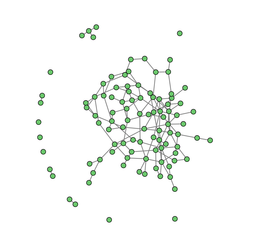
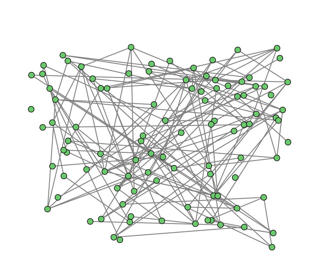
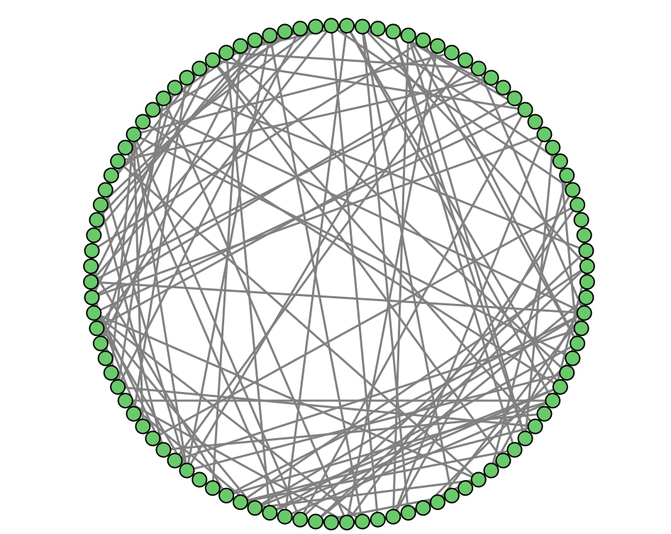
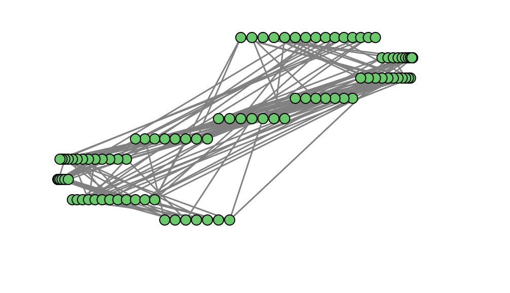
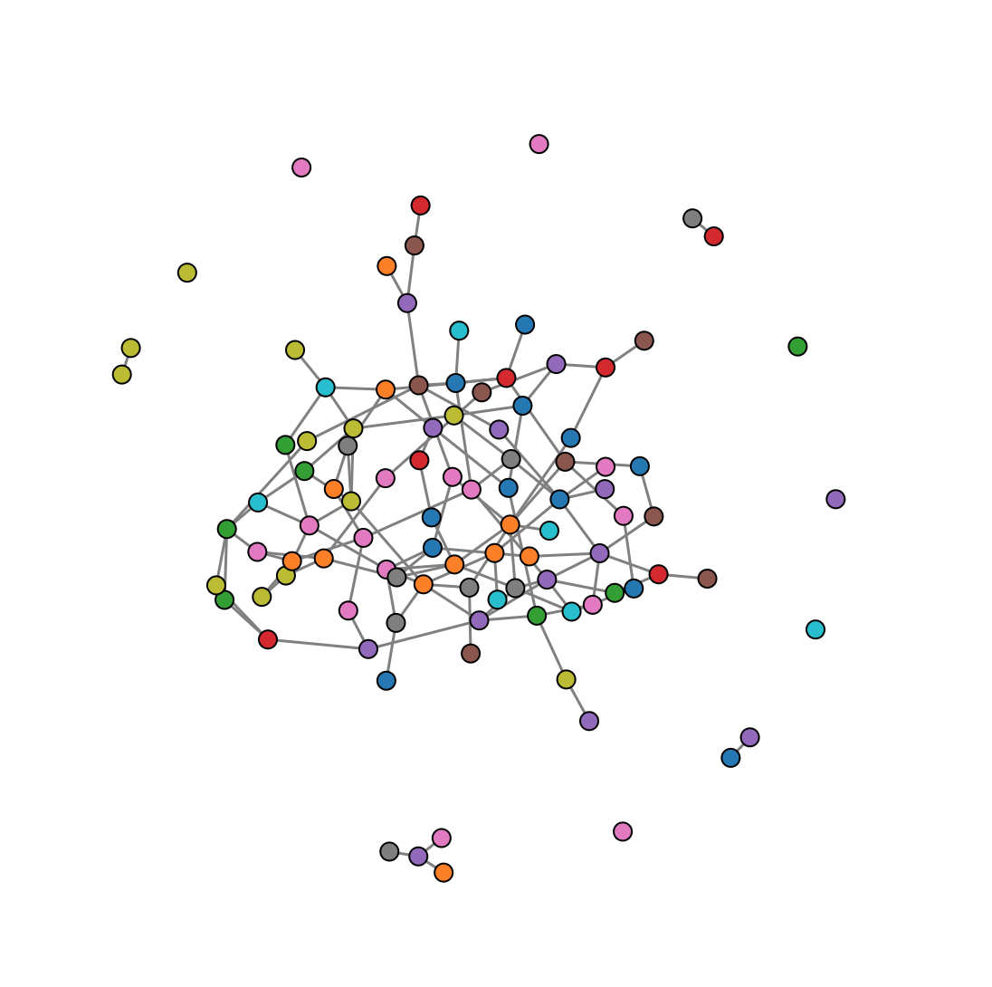
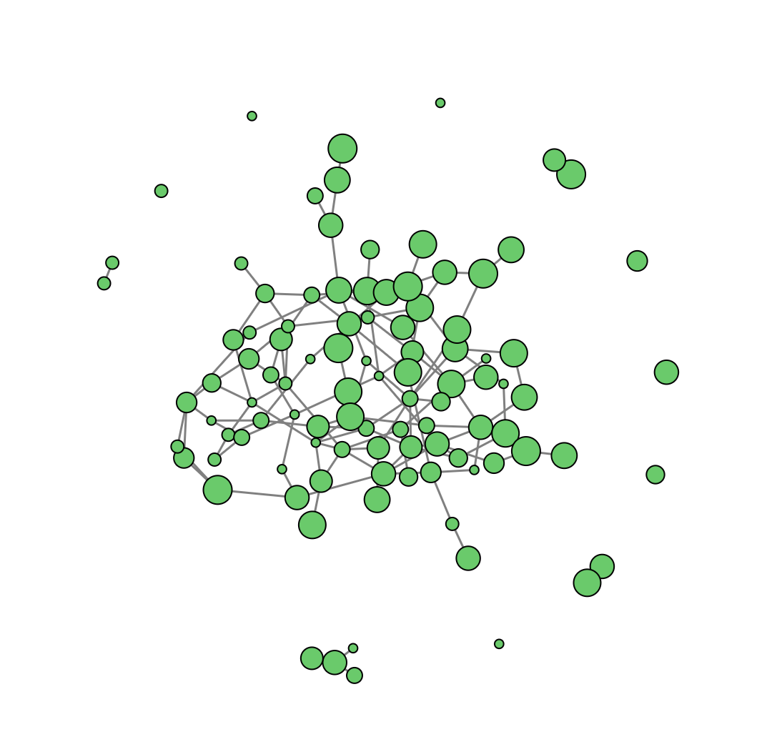
| Node-Link Graph | Example |
<img src="img/node-link.png" height=100>
- Mark:
<circle> - Position:
d3.forceSimulation() - Color:
fill(style)
Assignment: starting with this Node link diagram that is based on force layout with different layouts: random, radial, line, line by category and encodings: color, size.
d3.forceSimulationdocumentation- Parameters playground)
- Use multiple foci to group nodes by similariy
Projects (1/3)
Friday 07/02/2020 15:45-17:45
Projects (2/3)
Friday 14/02/2020 13:30-15:30
Peer-review of other groups projects
Pre-Requirements:
- Link to description of the project
- Link to design sheets/mockups
- Link to a demo hosted on GitHub
Peer-review:
- Are all the pre-requirements met? If not, what is missing?
- Summarize the projet (what you understand): who is the audience? which question does it address?
- Is the design effective? What would you recommend?
- Are you aware of a similar project that would help the project? If so, please add links to it.
- What are the strength of the project?
- What are the weaknesses?
- What would you have done differently?
- Any other remark?
Projects (3/3)
Friday 14/02/2020 15:45-17:45
You may also add the following header to your project:
<!DOCTYPE html>
<html lang="en">
<head>
    <title>YOUR_TITLE</title>
    <meta name="description" content="Your Description">
    <meta name="author" content="Authors">
    <meta property="og:title" content="Your Title">
    <meta property="og:description" content="Your Description">
    <meta property="og:image" content="https://theo-jaunet.github.io/MemoryReduction/assets/thumbnail.png">
...
</head>
In the class document:
- PROJECT_TITLE: title of the project (10 words max)
- PROJECT_DESCRIPTION: details of the project (2/3 sentences)
- PROJECT_AUTHORS: list of authors
- PROJECT_TWEET: tweet/social media-like presentation (see examples)
Projects: Final projects presentations & demos
Friday 21/03/2020 13:30-17:45
Each group has a 15min time slot (10min presentation, 5min questions) to present their project.
No slide: just show the visualization and tell a convincing story (e.g. don’t list features, etc.). Should address the following:
- Present context, dataset, data collection
- Describe key design decisions (visual mappings, interactions, animations, ..)
- Did the visualization help you find anything of interest in the dataset?
- Discuss technical challenges, limits, what you would have done with more time.
Add a README.md file in the repository organized as follows:
- Name of the participants of the project
- Description of the project
- Screenshots and/or video of the main features
- Credits to external code or data you may have used in your project
- Link to any document/report that may be related to your project
IMPORTANT – Regarding the dataset
- If you don’t want to share your dataset, add a demo/fake dataset (e.g. sample or fake data) for the live demo
- Provide a way to let users use their own dataset and explain how to do it (upload button? using a Python script? etc.)
- If you take screenshots with the real dataset make sure you preserve individuals privacy
As a general rule keep in mind the projects will be made public so anybody should be able to understand on their own and privacy of the datasets should be preserved.
Projects: Polish and final submission (autonomie)
Friday 28/02/2020 13:30-15:30
Projects: Polish and final submission (autonomie)
Friday 28/03/2020 15:45-17:45
Final project is due
Exam
Wednesday 11/02/2020
- 2h written exam
- Questions in French
- Answers either in French or English
- Bring drawing material (pen, eraser, eventually colors)
Online resources
Tableau Software
D3.js
- Gallery of examples
- Code examples and references for the course “D3.js in Motion”
- Relearning D3.js
- D3 in depth
- Awesome D3
- http://vadim.ogievetsky.com/IntroD3/#1
- https://github.com/arnicas/d3-faq
- Changes in D3 4.0
- D3 V4 - What’s new?
- Wide vs. Long Data in D3
- D3 Cheatsheet
SVG
Git/GitHub
- Git and GitHub (e.g. Try GitHub)
- https://agripongit.vincenttunru.com/
- https://onlywei.github.io/explain-git-with-d3/#freeplay
- https://learngitbranching.js.org/
JavaScript
- Mozilla Developers Network’s Javascript reference
- Learn JavaScript (e.g. JS learnxinyminutes, learnjsdata)
- JSON (e.g. JS learnxinyminutes)
- Eloquent JavaScript
- Notes on Douglas Crockford’s Javascript the Good Parts 🚀
Data Visualization Classes
- DataViz at MIT
- Visual Analytics Ecole Centrale Paris
- Dataviz resources
- https://curran.github.io/dataviz-course-archive/
- https://github.com/Ecohen4/data-viz
- https://github.com/arnicas/interactive-vis-course
- https://docs.google.com/spreadsheets/d/13H77ewqswroMtshWjDZkmcAEvFeRmEjrr-w9E2WHU-E/edit#gid=989980390
Blogs
- http://www.thefunctionalart.com/
- http://eagereyes.org/
- http://visualisingdata.com/
Books
Graphics/Journals
- http://www.bloomberg.com/visual-data/
- http://data.huffingtonpost.com/
Color
- D3 color schemes
- https://cloudflare.design/color/
- ColorBrewer
- https://ciechanow.ski/color-spaces/
- Nomenclature of colours
Misc
- Command line tutorial
- https://egghead.io/lessons/debugging-with-dev-tools
- Design essay: Picturing the Great Migration
- What to Expect in the Data Visualization Engineer Job Interviews
- State of JavaScript 2019