Project Gallery
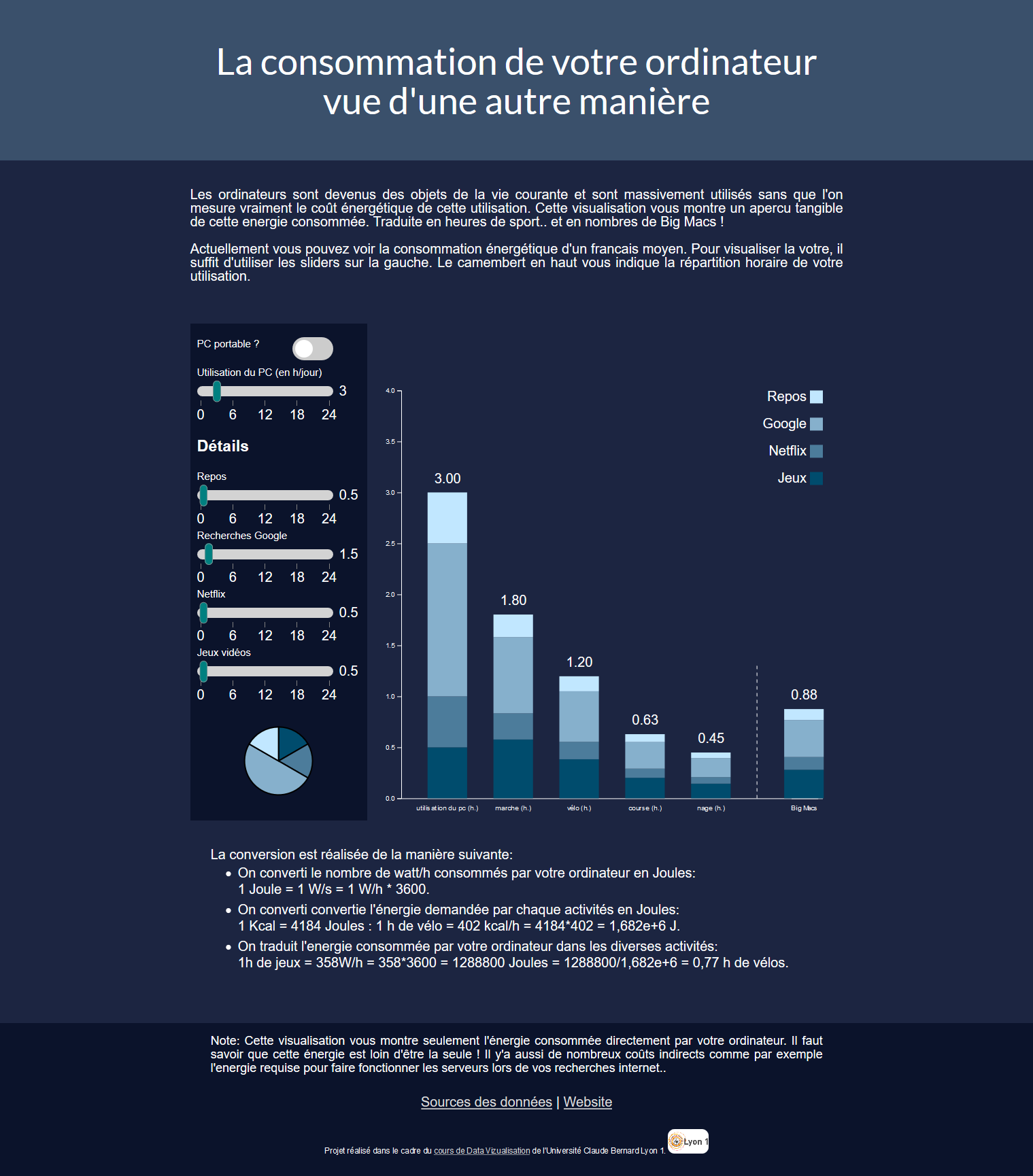
Power-consumption-analogy
Within this project, we’re coming from two simple observations :
- Our usage of computers has electric cost and therefore an environmental impact
- We have little to no concrete representations to help us understand that very impact
That is why we want to help people visualize their electric energy consumption, using an analogy with several sportive activities.
We propose a visualisation of the hourly volume of sport you would have to perform in order to supply your computer (laptop or desktop) for your daily use.
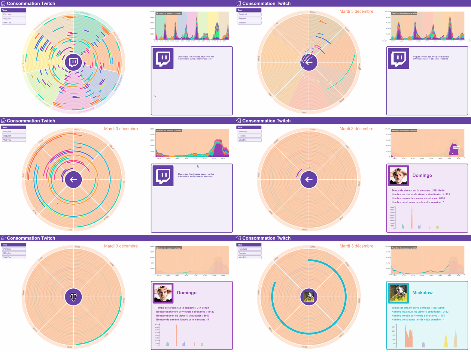
Visualization of the Twitch streaming consumption in france
Our project is a visualization of streaming consumption of the 30 streamers considered as the most populars in France.
This visualization highlights three main types of streamers:
- Ponctual streamers, they stream once or twice per week, ex : Squeezie
- Regular streamers, they stream almost everyday, ex : Locklear
- Web TVs, they can be compared to television channels. Streamers take turn in several shows on those channels, the stream is almost never interrupted on the whole week, ex : Solary
You can access to the visualization of this project here.
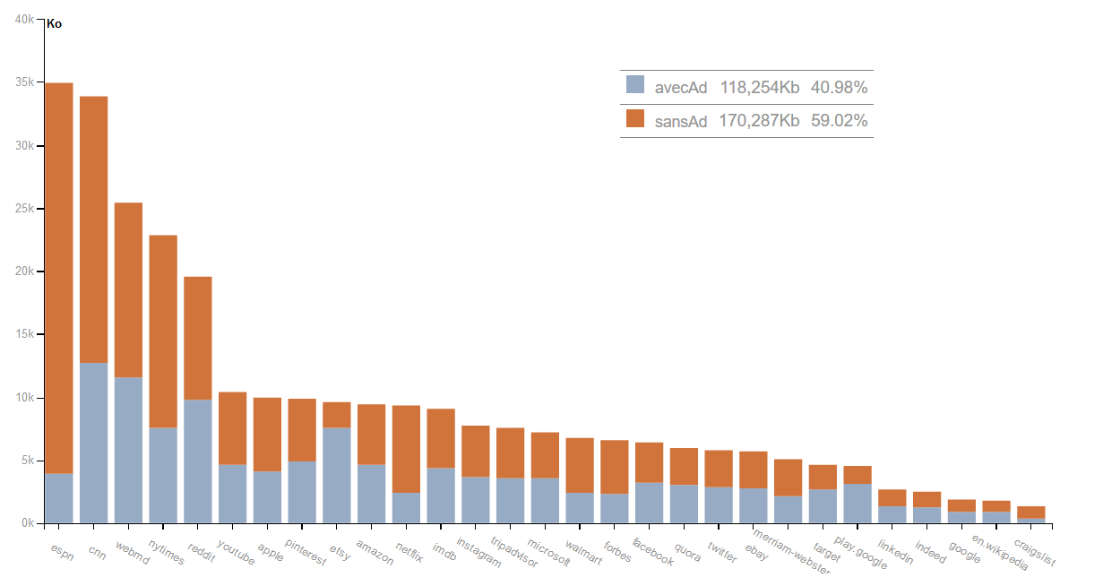
Data consumption with and without add-blocker
This project aims to show the effect of add-blockers on data consumption and loading time. Advertisements can indeed be an important part of the data and blocking it can be a way of reducing the loading time and our consumption. We have collected data on the 30 most visited websites with and without add-blocker to develop this datavizualisation.
VizHabits
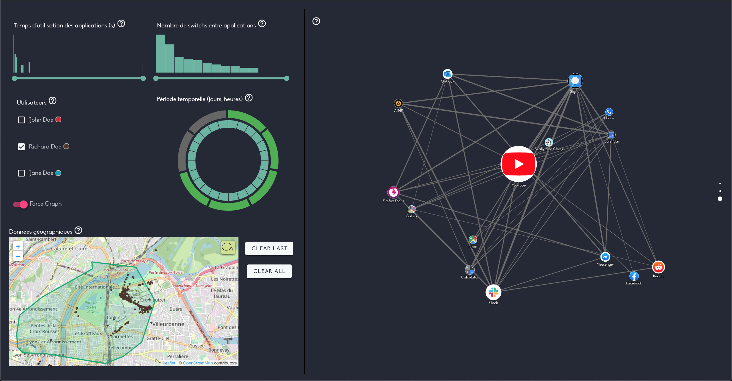
This projet aims to complete existing visualisations of users smartphones habits. The idea behind this project is based on a fact : we didn’t find any visualization able to show us usage profiles based on application switches and sequences of applications.
We propose two visualisations for two differents purpose :
- A Force Graph, representing which app the user usually go to after using a specific application.
- A Radial Tree (Tidy), representing all sequences started by unlocking the phone (Screen ON) and terminated by locking the phone (Screen OFF).
As our visualizations can be a bit messy when the amount of data to display grows, we decided to work on how we can effectively filter our visualisations to be more user friendly. These filters can also be a great tool to explore different usage profiles by navigating through several dimensions, including time and space.
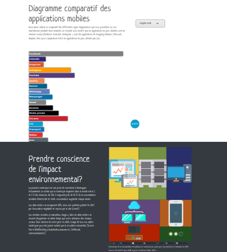
Data consumption of social networks on mobile devices (environmental impact, comparison with other applications)
Our visualization shows the data consumption of social networks on mobile as well as its environmental impact.
In fact, we use various mobile applications on a daily basis but we do not really know their consumption (data stored and consumption in mobile/wifi data). The storage of data generated by its applications in datacenters generates digital pollution and environmental impact.
Our goal was therefore to raise awareness of this impact in the use of social networks in our daily lives.
This visualisation is intended for a wide audience, but more particularly for the young population of the digital era who are the biggest users of social networks.
Dataviz - Applications Memory Consumption
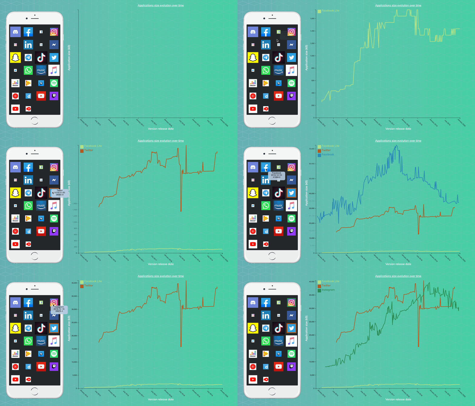
The memory of our phone is often perceived as an element limiting the functionality of our devices, preventing us from installing certain applications that have sometimes become too greedy in terms of space. It’s also becoming increasingly difficult to update all the applications due to their increasing size. But how much does this size change over the months? Are there alternatives, lighter apps to replace the ones we can’t keep anymore? Is the size difference between applications important between Android and iOS phones?
This school project aim is to, through a web page, visualize and clarify those questions that users find it difficult to outline with their device.
The website can be found here: https://sitiel.github.io/App-size-compare/

Consumption of blockchain
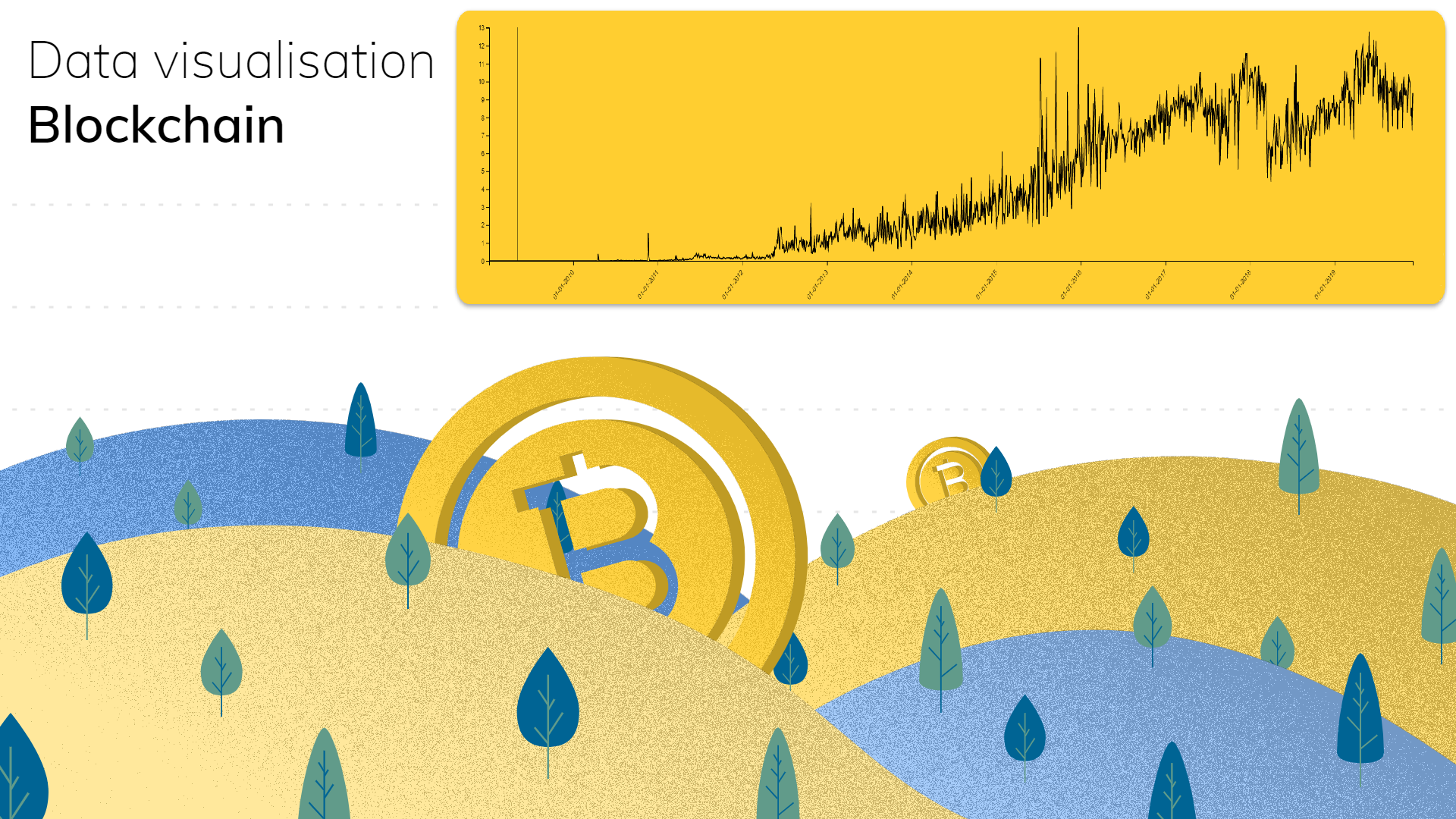
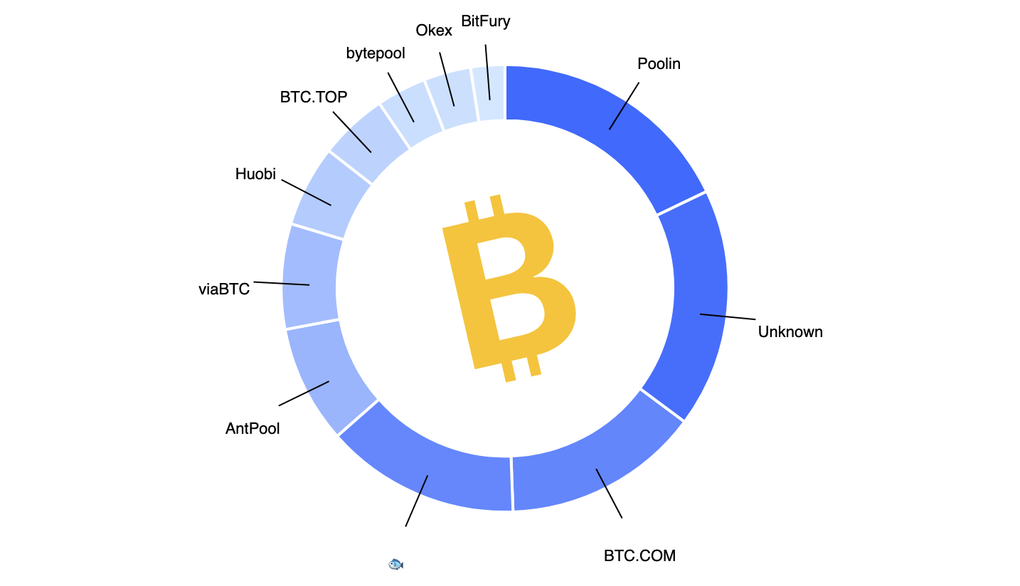
As the bitcoin usage expands every day, people may be concerned with the environmental impact of this technology. We propose some visualisation to see the evolution of bitcoin transaction consumption, comparisons of the whole Bitcoin system with usual items and the mining profitability.
Bitcoin Electricity Consumption
Bitcoin is a crypto-currency often criticized for its viability. Why ? The energy chasm it represents. Mining bitcoin requires a great computing power, meaning a proportional amount of energy.
This visualization aims to give information about the energetic viability of Bitcoin : its origins, its evolution, comparision elements. It is therefore aimed at anyone interested in cryptocurrencies and the ecological impact.
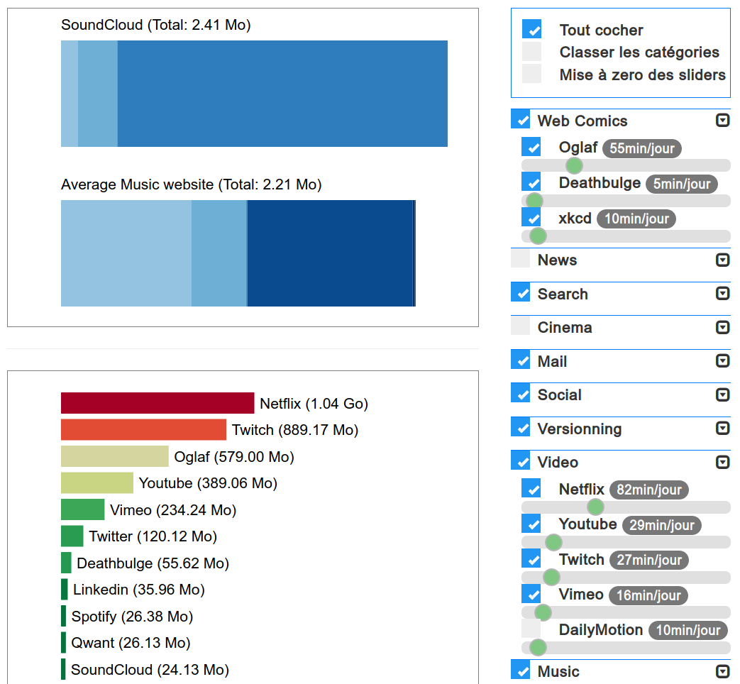
Websites data consumption
In a world where data is sometimes still limited and results in significant energy consumption, one could wonder how to use less of it.
This visualisation aims to help you rank websites from best to worst in the amount of data they use, and adapt to your everyday use with customizable options.
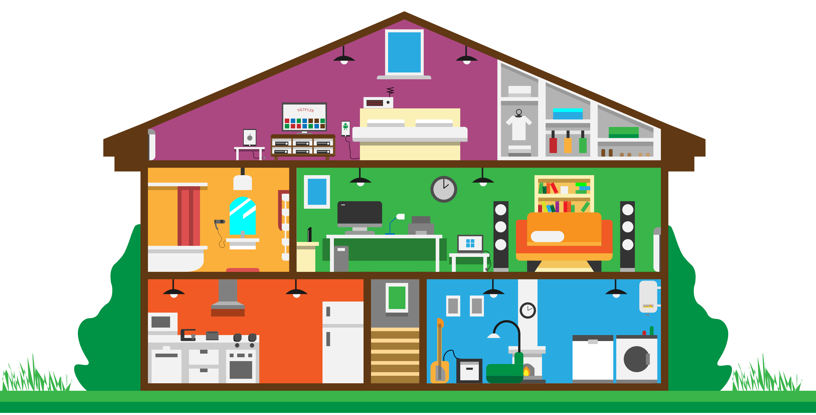
Visualization of the electricity consumption of a household
The need to protect our planet and reduce our impact on the environment is becoming more and more urgent, and requires our daily attention. Each person can act at their level and especially at their home. In this project, we are interested in the electricity consumption of of every device in a household in France. We want to consider everyday devices in order to provide precise and quantitative information on their ecological impact. The main objective of this project is to provide a tool allowing families to know which devices consume the most, and therefore on which ones they need to act first.
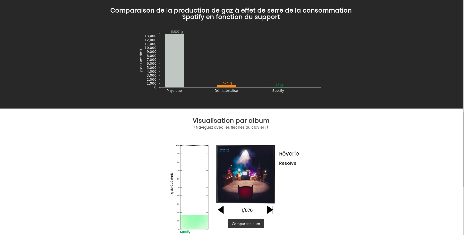
Spotiviz
Spotiviz is an university project. Our purpose is to allow people to visualise the greenhouse gas emissions caused by their use of platforms like spotify. We also want people to be able to compare different mediums to adapt their habits. That is why we chose to compare these emissions to those which would have been caused by physical or dematerialized CD.
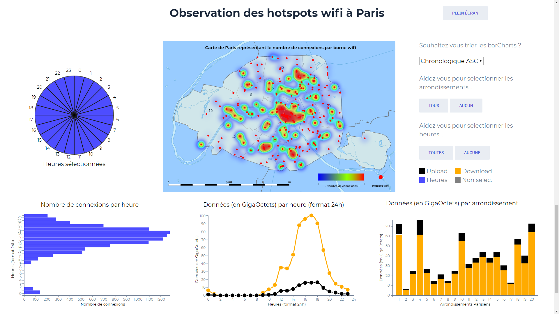
Consumption paris wifi
As part of our last year of master, we worked on a data visualization project. We chose to study the data consumption of Paris wifi hotspots. Here is the question we wanted to answer:
How to allow the municipality to better distribute its hotspots according to the data consumption and the density of the inhabitants ?
To do this, we used a public government dataset. For the realization of the views we used d3.js. We then integrated our visualizations into a web template.
Analysis of data consumption in the background and in the foreground
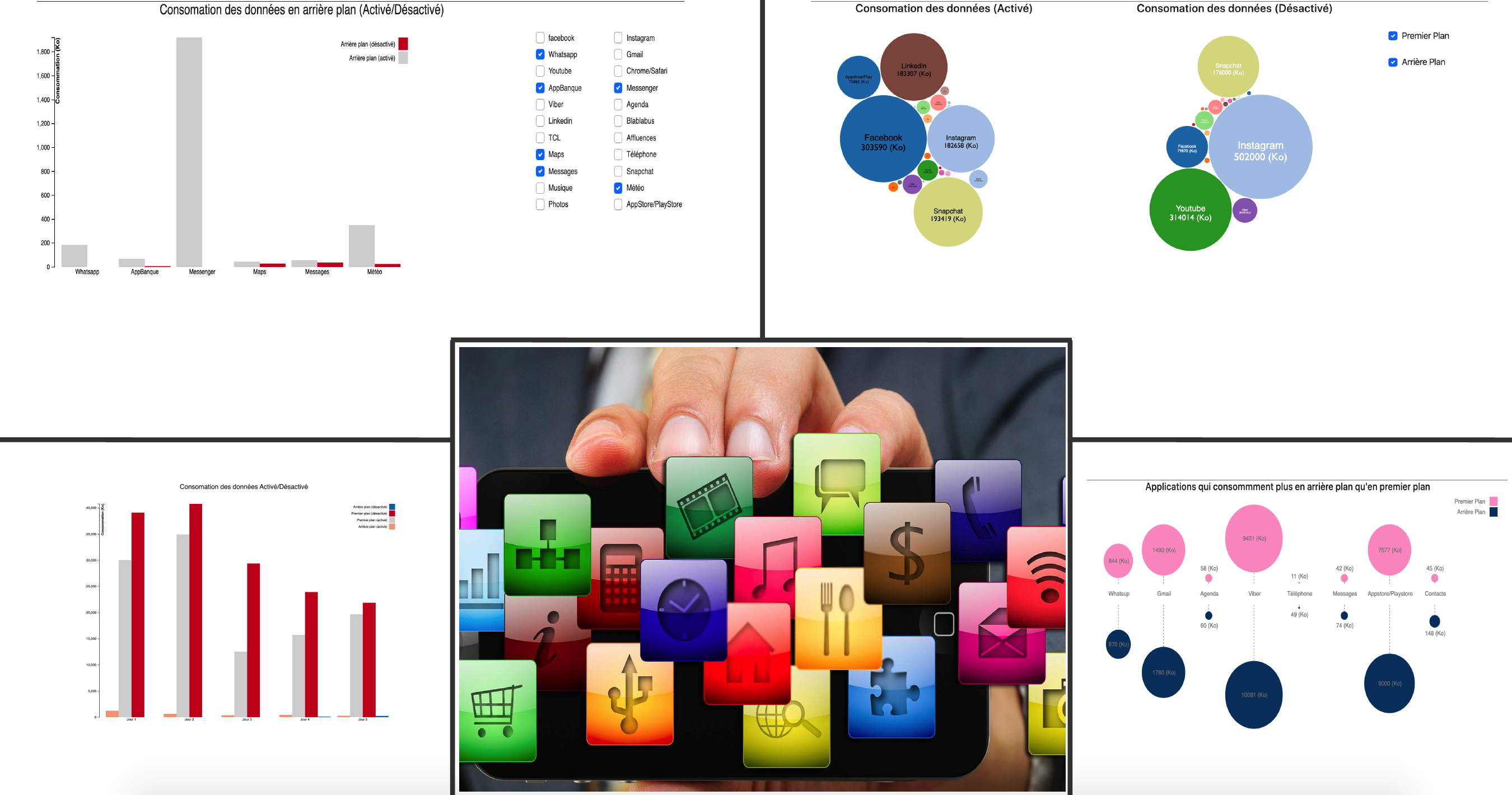
How to take full advantage of the potential of your smartphone while limiting the consumption of mobile data in your data plan? The problem addressed is the consumption of data in the background of applications on smartphones. Indeed, the background data is data that our applications constantly use, even when our phone is in our pocket. We want to show what the consumption of data in the background represents in relation to our total consumption by activating and deactivating the updates in the background. So we decide to generate our own data by making daily statements of data consumption for several applications. So we highlight the applications that consume the most both in the foreground and in the background and the results hold some surprises …
Analysis of popularity of programming languages used in GitHub
This project offers a vizualisation of the popularity of programming languages used in GitHub. It is based on some metrics to measure popularity, like the number of stars and the number of forks, and it is displayed year by year. The main goal of our project is to give tools to junior developpers (for example, to help them to choose a language for their project) and to senior developpers by helping them to be up-to-date.
